scroll
➔
Auckland University of Technology (AUT) wanted to equip prospective and newly arrived international students with a resource that was both practical and brand-strengthening - a guide that would demonstrate AUT’s student experience, outline essential information, and support its global recruitment pipeline.
Auckland University of Technology (AUT) wanted to equip prospective and newly arrived international students with a resource that was both practical and brand-strengthening - a guide that would demonstrate AUT’s student experience, outline essential information, and support its global recruitment pipeline.
AUT required a Field Guide that was multi-purpose, able to work across:
Offshore recruitment and agent networks
Pre-arrival decision-making
Onshore orientation
The guide also needed to be culturally adaptable, including a fully translated Chinese version to ensure accessibility and relevance for one of AUT’s largest international cohorts.
This aligned strongly with Insider’s Field Guide capability, which positions Field Guides as portable, visually engaging tools designed to communicate a university experience clearly and persuasively to international students.
Insider’s approach was to design a Field Guide that was student-centric, visually rich, and strategically structured to support the international decision-making journey.
Using the AUT brand and student experience pillars, we developed a guide that:
Introduced the AUT experience with clarity and warmth
Included student voices
Highlighted Auckland as a welcoming global city for study
Provided practical information
The final guide reflects AUT’s positioning as a modern, industry-connected university committed to supporting diverse international learners.
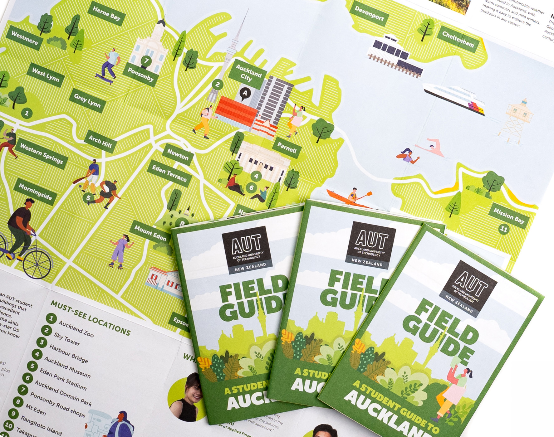
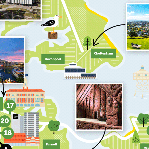
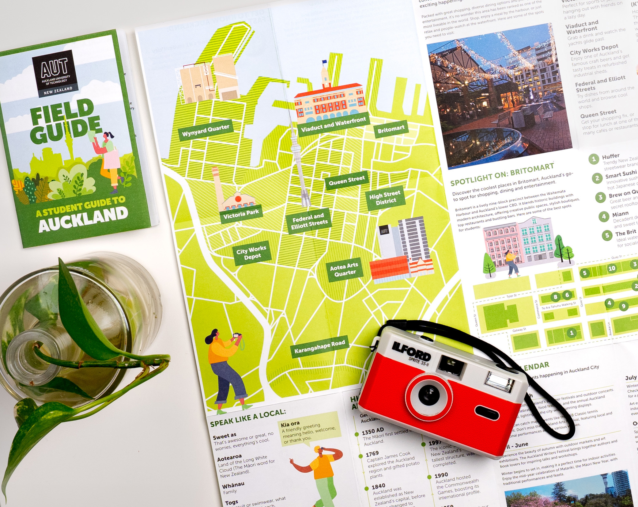
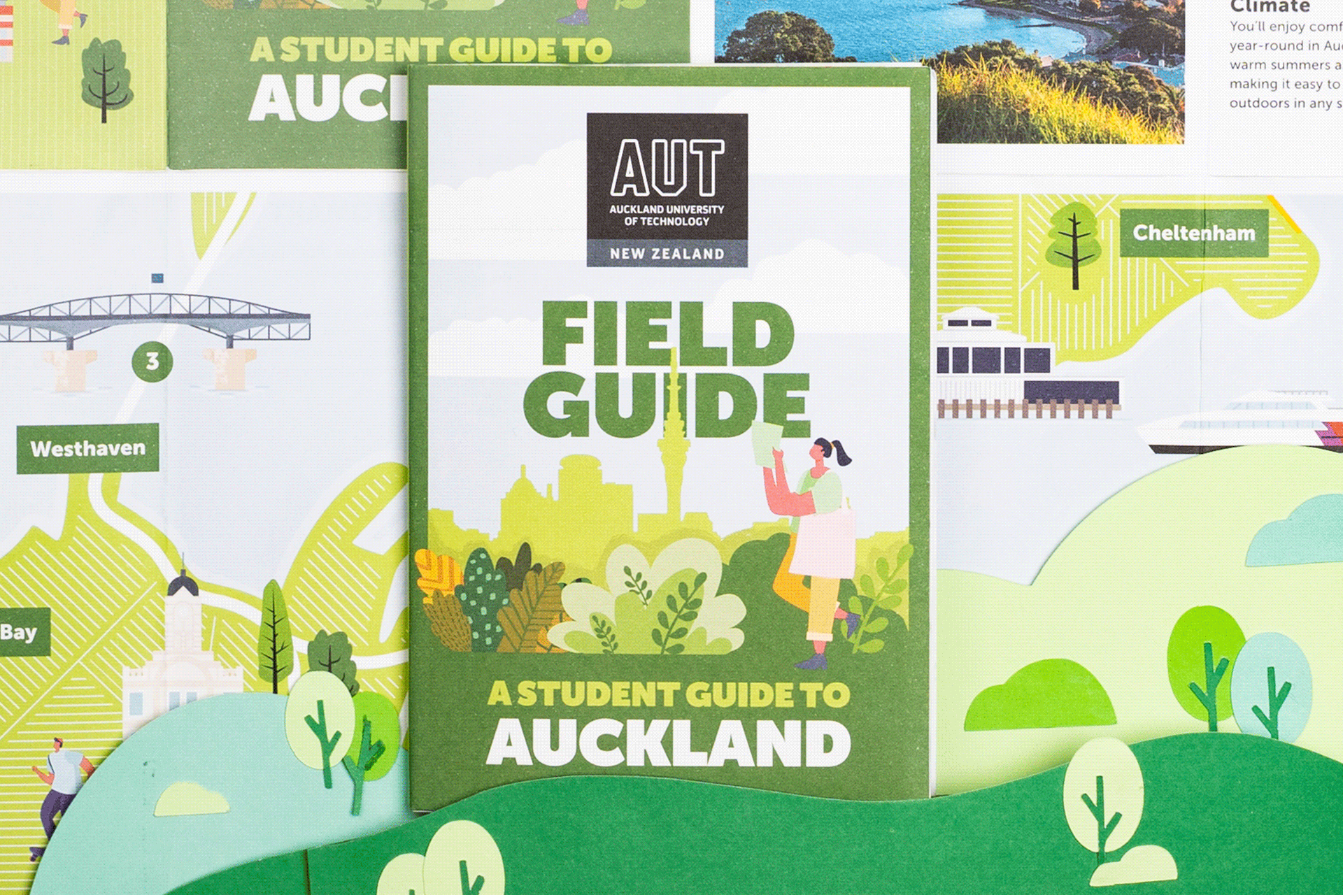
Drawing from Insider’s Field Guide design framework, the AUT guide balanced engaging visual storytelling with highly functional layout design.
Key creative features included:
Clear page architecture with bold headings and intuitive navigation
Modern illustration and iconography drawn from Insider’s Field Guide design language
Rich photography showcasing campus life, diversity and the Auckland environment
Modular content blocks that allow the guide to be updated or modified for future intakes
Culturally adaptive translation layout for the Chinese edition, ensuring readability and brand consistency
This approach reflects Insider’s commitment to design that is not merely aesthetic, but purpose-built for international audiences navigating major life decisions.